



Updated 11 February 2021
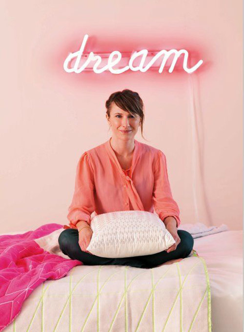
Stylist and editor Vanessa Colyer Tay is known for her beautiful and considered styling, and her trend-spotting ability is showcased weekly in Sunday Style magazine. We asked her about the beauty of barely-there blush as we share a few of the gorgeous examples we spotted on her Pinterest boards. You can also follow Vanessa on Instagram @miss_ness_tay.
If a room laden with soft tones like blush were a person she would be humble, nurturing, huggable and calm – it's for this reason I love working with this subtle colour palette. To me, it's important for some areas of the home to feel like an escape from the distractions and busyness of our outside lives. The great thing about interiors is that you can adapt them to provide the energy that you'd like feel more of in your life.
A patterned wallpaper in blush hues complements grey bedding and a myriad of small scale pattern. The chosen wallpaper from Love Mae 'hugs' the room, making it a beautiful space for a little girl to rest in.
Introducing a small hit of something a little less coordinating like bright yellow will take blush out of the eighties and into the now.
The key to using soft tones like this in upholstery by No Chintz is to add in some complementary detailing like a brightly coloured piping. I personally find that working with soft colours in upholstery is a great alternative to white because it adds warmth, ages gracefully and feels part of a refined colour scheme. Soft tones like this also provide a solution to people who are interested in using colour but would prefer to avoid anything too bold.
I love this easy DIY (by Finnish stylist Susanna Vento via Remodelista) for a little girls room, or in an overall white room to add in a small dash of interest. By positioning your dash of colour at the top of the pendant, when installed it will be very subtle and should offer your room a lovely layer of extra detail.
Using vessels with graduated colour is the perfect way for a 'neutrals only' stylist to include a hit of this remarkable hue. Vessels by Anna-Carin Dahl, from Elevate Design.
Vanessa Colyer Tay on blushing beauty
Stylist and editor Vanessa Colyer Tay is known for her beautiful and considered styling, and her trend-spotting ability is showcased weekly in Sunday Style magazine. We asked her about the beauty of barely-there blush as we share a few of the gorgeous examples we spotted on her Pinterest boards. You can also follow Vanessa on Instagram @miss_ness_tay.
If a room laden with soft tones like blush were a person she would be humble, nurturing, huggable and calm – it's for this reason I love working with this subtle colour palette. To me, it's important for some areas of the home to feel like an escape from the distractions and busyness of our outside lives. The great thing about interiors is that you can adapt them to provide the energy that you'd like feel more of in your life.
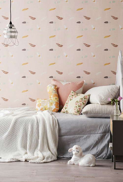 Image – Sam McAdam-Cooper. Styling – Vanessa Colyer Tay.
A patterned wallpaper in blush hues complements grey bedding and a myriad of small scale pattern. The chosen wallpaper from Love Mae 'hugs' the room, making it a beautiful space for a little girl to rest in.
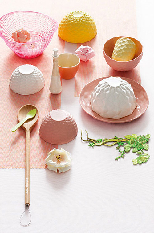 Image – Sam McAdam-Cooper. Styling – Vanessa Colyer Tay for Inside Out.
Introducing a small hit of something a little less coordinating like bright yellow will take blush out of the eighties and into the now.
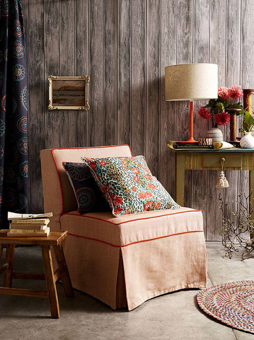 Image – Tim Robinson. Styling – Vanessa Colyer Tay for No Chintz.
The key to using soft tones like this in upholstery by No Chintz is to add in some complementary detailing like a brightly coloured piping. I personally find that working with soft colours in upholstery is a great alternative to white because it adds warmth, ages gracefully and feels part of a refined colour scheme. Soft tones like this also provide a solution to people who are interested in using colour but would prefer to avoid anything too bold.
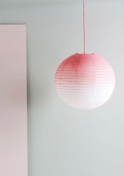 Image – Susanna Vento via Remodelista
I love this easy DIY (by Finnish stylist Susanna Vento via Remodelista) for a little girls room, or in an overall white room to add in a small dash of interest. By positioning your dash of colour at the top of the pendant, when installed it will be very subtle and should offer your room a lovely layer of extra detail.
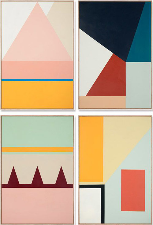 Paintings by Esther Stewart
Australian artist Esther Stewart has a knack for mixing colour – look to her work for inspiration or use it to adorn your walls. Geometric lines paired with blush will offer a slightly more masculine take on this often over-feminised colour.
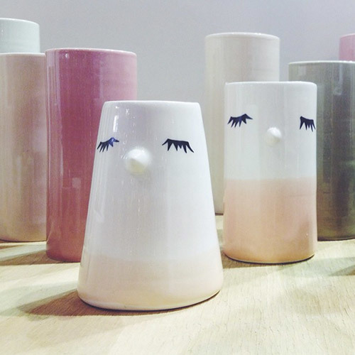 Image via Instagram @miss_ness_tay
Using vessels with graduated colour is the perfect way for a 'neutrals only' stylist to include a hit of this remarkable hue. Vessels by Anna-Carin Dahl, from Elevate Design.
Explore More








Head Office (No Showroom)
2/1-7 Unwins Bridge Rd, St Peters,
NSW 2044, Australia
Your customer reference #:
01-X-CSN