


Blog

Updated 3 December 2020
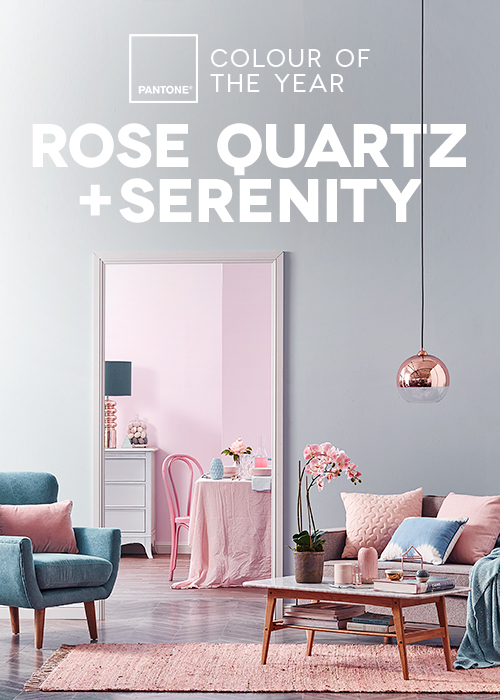
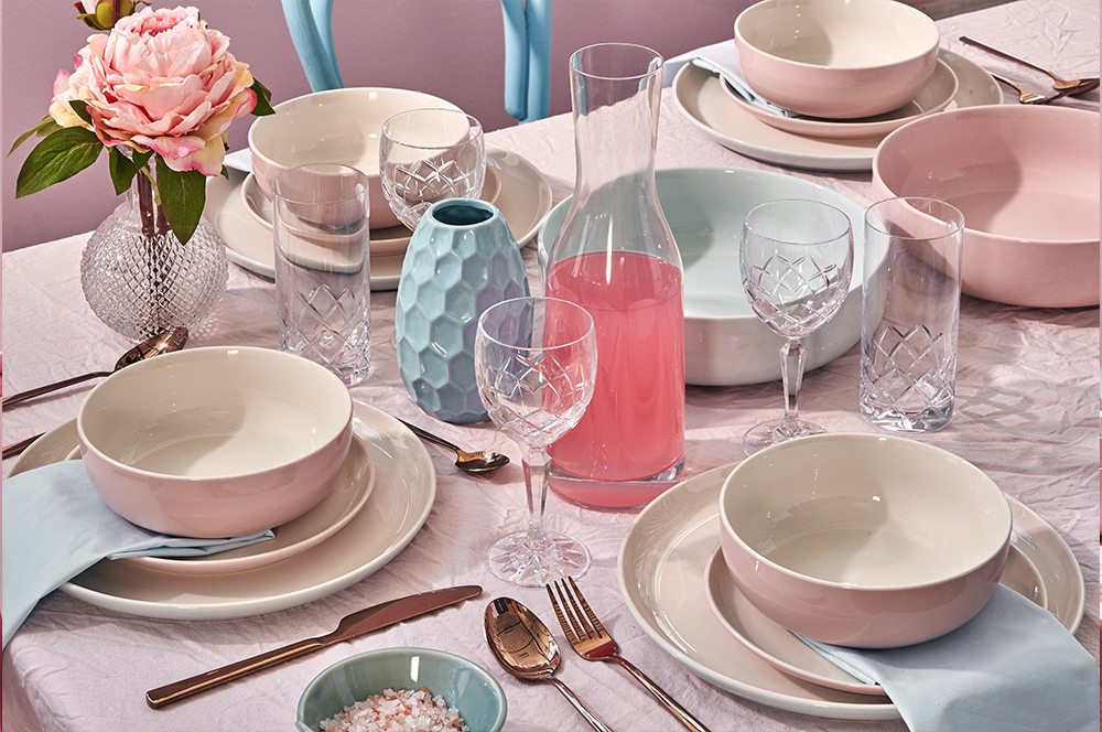
Pantone puts a lot of thought into colour. Every 12 months they produce a swatch that signifies the year to follow. To mark 2016, they've decided to combine rose quartz (a tranquil dusky pink) and serenity (a soothing baby blue). This selection is softer than previous picks and it's also the first time the Institute has chosen 2 colours. You can shop our spin on 2016's colour pairing here, but first, stick around to pick up some styling tips from Temple and Webster's Senior Stylist, Jonathan Fleming...
In describing the winning combo, Pantone say that their "approach to color is coinciding with societal movements toward gender equality and fluidity, the consumer's increased comfort with using color as a form of expression, {cke_protected_1} a generation that has less concern about being typecast or judged." So what does that mean for your home? Let our stylist share some words of wisdom.
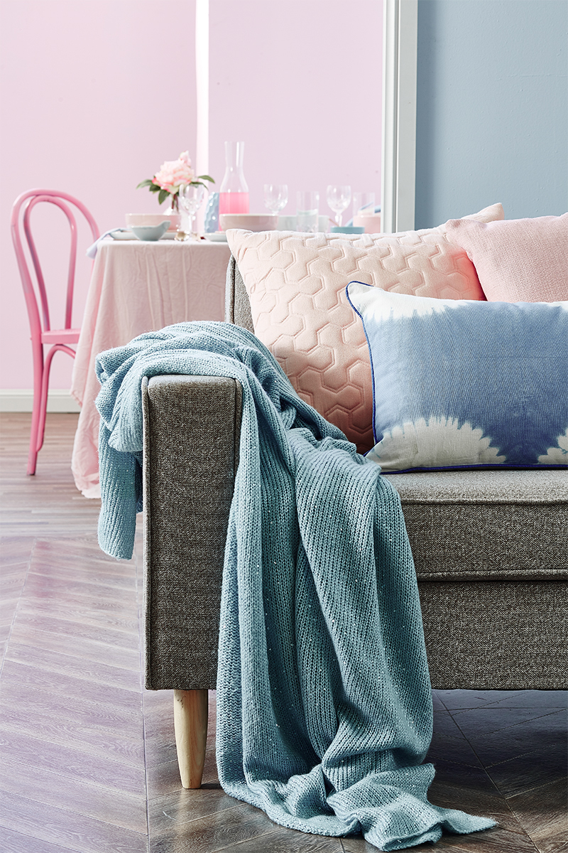
To kick things off, Jono suggests using pale grey and other neutrals as a base for the pastels. It allows a little space to breathe and offers a place for the eye to rest. As always, mix up your textures - quilted cushions against a knitted throw, for example.
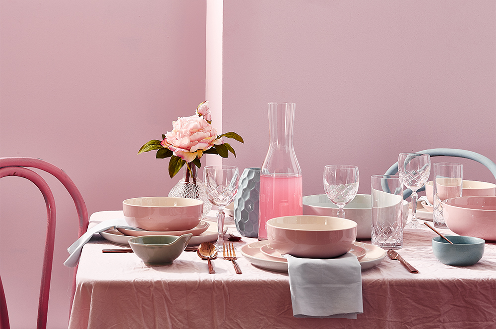
"There's no need to start with painting the walls," Jono says. "Instead, introduce the colours with small decorative accents such as a vase or florals." Like any good stylist, he values a good sift through things you have already, too. "You never know what might be lying around."
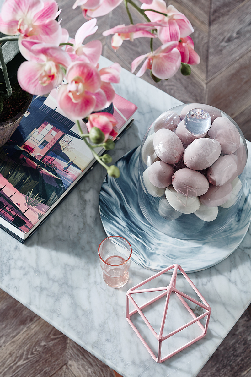
Metallics are a brilliant way to add a little maturity when you're dealing with shades that are essentially pretty pastels. "Bring in luxe metal finishes like rose gold cutlery or a dazzling pendant light to instantly lose the junior feel," Jono advises.
If you're still searching for more inspiration on Pantone's pairing, skip over to our purpose-built Pinterest board.
Rose quartz & serenity for 2016
 Photography - Denise Braki. Styling - Jonathan Fleming.
Pantone puts a lot of thought into colour. Every 12 months they produce a swatch that signifies the year to follow. To mark 2016, they've decided to combine rose quartz (a tranquil dusky pink) and serenity (a soothing baby blue). This selection is softer than previous picks and it's also the first time the Institute has chosen 2 colours. You can shop our spin on 2016's colour pairing here, but first, stick around to pick up some styling tips from Temple and Webster's Senior Stylist, Jonathan Fleming...
 Photography - Denise Braki. Styling - Jonathan Fleming
In describing the winning combo, Pantone say that their "approach to color is coinciding with societal movements toward gender equality and fluidity, the consumer's increased comfort with using color as a form of expression, {cke_protected_1} a generation that has less concern about being typecast or judged." So what does that mean for your home? Let our stylist share some words of wisdom.
 Photography - Denise Braki. Styling - Jonathan Fleming
To kick things off, Jono suggests using pale grey and other neutrals as a base for the pastels. It allows a little space to breathe and offers a place for the eye to rest. As always, mix up your textures - quilted cushions against a knitted throw, for example.
 Photography - Denise Braki. Styling - Jonathan Fleming
"There's no need to start with painting the walls," Jono says. "Instead, introduce the colours with small decorative accents such as a vase or florals." Like any good stylist, he values a good sift through things you have already, too. "You never know what might be lying around."
 Photography - Denise Braki. Styling - Jonathan Fleming
Metallics are a brilliant way to add a little maturity when you're dealing with shades that are essentially pretty pastels. "Bring in luxe metal finishes like rose gold cutlery or a dazzling pendant light to instantly lose the junior feel," Jono advises.
If you're still searching for more inspiration on Pantone's pairing, skip over to our purpose-built Pinterest board.
Explore More


Payment options
Head Office (No Showroom)
2/1-7 Unwins Bridge Rd, St Peters,
NSW 2044, Australia
Your customer reference #:
01-X-CSN