


Blog

Updated 8 January 2021
Karen McCartney writes about her natural colour home - the grey palette - and all the ways she loves it.
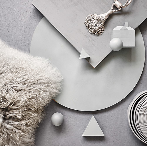
I participated in a workshop last week, learning about the complexity of creating the perfect white paint. Some of my mixes were embarrassingly off the original– who knew a tad of vermillion was what was needed to bring my errant shade into line! But while engaged in the alchemy of white, my eye kept travelling to the wall of samples that showcased an impressive range of greys. Grey is my natural colour home – where I am happiest and most confident - be it with the palest of smokes or the densest of leads.
The dove grey interior is to my mind an instant passport to interior success and has the fluidity to be applied across all rooms of the house. It is also a friend to white, which suddenly looks sharper and cleaner in its company. And I do practise what I preach. We have a holiday house with expanses of plasterboard, which we felt would be too stark in white and too overwhelming in a ‘colour’. We also wanted to unify the space by using the same paint shade across living, dining, bedrooms and bathrooms. Yes, choosing the right shade took some time, but many swatches later (1 metre square is recommended) we took the plunge with a whisper-soft grey. What is remarkable is the way in which different orientations and different surfaces all vary in effect, giving the appearance of finely nuanced paint choices when they are in fact the same. The timber boards on the exterior of the house were stained a grey, which complemented the surrounding eucalypts and the green of the vegetation.
And the joy of grey doesn’t stop at surfaces. It is a colour, in all its manifestations, that works well in linens, velvets, knits, sheepskins, stained onto timber and fired into tiles. It is also stylistically promiscuous and can adapt to a high-end French regency inspired interior as much as a contemporary, rustic, bohemian or Scandinavian one.
An interior can be entirely created in shades of grey (50 if you are up to it) playing with texture, form, depth of shade and then accented with the precision of white or further intensified with an indigo or navy. I have a friend with a design business in New York called coolgreyseven after the Pantone colour of the same name – now that is commitment.
Karen McCartney on decorating with grey
Karen McCartney writes about her natural colour home - the grey palette - and all the ways she loves it.
I participated in a workshop last week, learning about the complexity of creating the perfect white paint. Some of my mixes were embarrassingly off the original– who knew a tad of vermillion was what was needed to bring my errant shade into line! But while engaged in the alchemy of white, my eye kept travelling to the wall of samples that showcased an impressive range of greys. Grey is my natural colour home – where I am happiest and most confident - be it with the palest of smokes or the densest of leads.
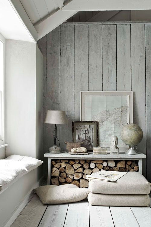 Hope House in Cornwall. Image - Paul Massey
The dove grey interior is to my mind an instant passport to interior success and has the fluidity to be applied across all rooms of the house. It is also a friend to white, which suddenly looks sharper and cleaner in its company. And I do practise what I preach. We have a holiday house with expanses of plasterboard, which we felt would be too stark in white and too overwhelming in a ‘colour’. We also wanted to unify the space by using the same paint shade across living, dining, bedrooms and bathrooms. Yes, choosing the right shade took some time, but many swatches later (1 metre square is recommended) we took the plunge with a whisper-soft grey. What is remarkable is the way in which different orientations and different surfaces all vary in effect, giving the appearance of finely nuanced paint choices when they are in fact the same. The timber boards on the exterior of the house were stained a grey, which complemented the surrounding eucalypts and the green of the vegetation.
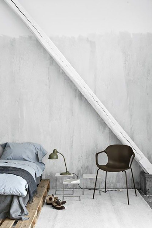 Image via Pinterest (source unknown)
And the joy of grey doesn’t stop at surfaces. It is a colour, in all its manifestations, that works well in linens, velvets, knits, sheepskins, stained onto timber and fired into tiles. It is also stylistically promiscuous and can adapt to a high-end French regency inspired interior as much as a contemporary, rustic, bohemian or Scandinavian one.
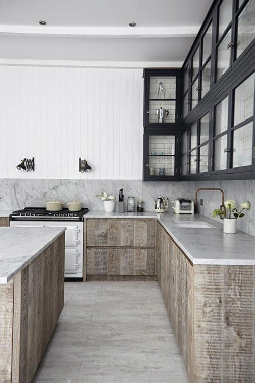 Kitchen by Blakes London
An interior can be entirely created in shades of grey (50 if you are up to it) playing with texture, form, depth of shade and then accented with the precision of white or further intensified with an indigo or navy. I have a friend with a design business in New York called coolgreyseven after the Pantone colour of the same name – now that is commitment.
Explore More


Payment options
Head Office (No Showroom)
2/1-7 Unwins Bridge Rd, St Peters,
NSW 2044, Australia
Your customer reference #:
01-X-CSN