



How to decorate with jewel tone colours
There's no question that jewel tones can give any space a touch of elegance and make you feel like royalty, but they can be a bit daunting to decorate with. When done right, they shine like the precious gems they are named for, and when done wrong, can end up looking like a mishmash of clashing colours. We dug up the dos and don'ts of styling with jewel tones so you can live more lavishly.
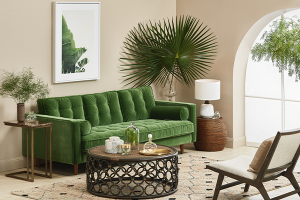
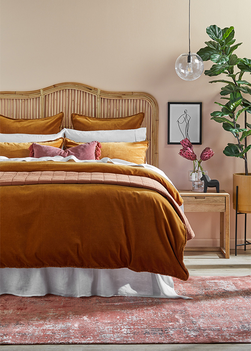
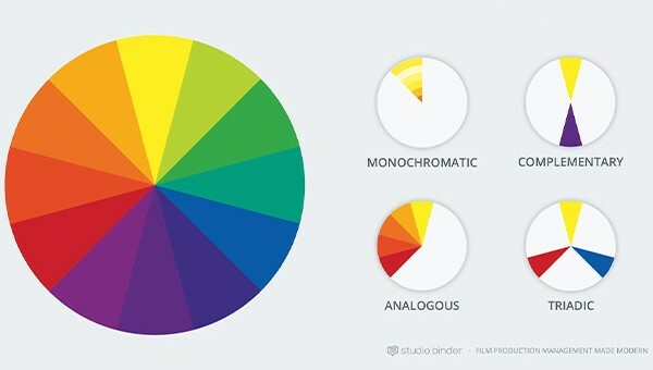
Pick either analogous colours (three colours side by side), complementary colours (the shades opposite each other on the wheel) or select your one favourite tone and decorate with a range of shades in that family for a monochromatic look. For example, mix an amber tone with ruby and rose quartz for an analogous look, or take on amethyst with bright citrine for a complementary look.
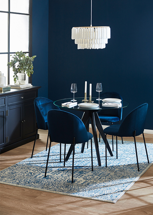
It's important to think about what other finishes you'll be working with, so consider if furniture legs are in gold, brass or silver metallics. You'll want to make sure the same shade and finish metallic is repeated throughout the space to tie it all together, keeping in mind that gold lends itself to warmer toned rooms with red and yellow colouring and silver feels more at home with cooler tones like green and blue.
What are jewel tone colours
Like the name suggests, jewel tones are saturated colours with names taken from precious gems. While the first image that comes to mind is of bright, bold hues, jewel tones also have lighter counterparts, which are a great way to ease into this decorating trend. Lighter tones lend themselves more to earthy styling and don't appear too high-contrast, which can take getting used to.Creating beautiful jewel colour combinations
First thing's first, get out your colour wheel. Just like styling any space, you want colours that are going to bring out the best in each other, but when it comes to jewel tones it's even more important to play by the colour wheel rules so your hues perfectly complement or contrast.Pick either analogous colours (three colours side by side), complementary colours (the shades opposite each other on the wheel) or select your one favourite tone and decorate with a range of shades in that family for a monochromatic look. For example, mix an amber tone with ruby and rose quartz for an analogous look, or take on amethyst with bright citrine for a complementary look.
Tips for incorporating jewel tones into your home
You want your jewel tones to be the hero of the room, so start with a specific base colour or a neutral palette so the bright colours really pop. Don't be afraid to go big with a bold statement rug or luxurious velvet sofa in the colour of your choice; these tones are begging to be seen so there's no need to relegate them to tiny touches. Make sure to mix up the fabrics to keep the room from looking flat, like pairing linen bedding with textured cushions and a big cosy knit throw.It's important to think about what other finishes you'll be working with, so consider if furniture legs are in gold, brass or silver metallics. You'll want to make sure the same shade and finish metallic is repeated throughout the space to tie it all together, keeping in mind that gold lends itself to warmer toned rooms with red and yellow colouring and silver feels more at home with cooler tones like green and blue.

Explore More








Head Office (No Showroom)
2/1-7 Unwins Bridge Rd, St Peters,
NSW 2044, Australia
Your customer reference #:
01-X-CSN