


Blog

Updated 20 August 2020
Colour we love: Beautiful berry
We're days away from Autumn, and as the last rays of summer sun start to cool our attention here at T&W is turning towards the updates, colours and interior combinations we'll be introducing for the new season. High on our list is berry - bringing depth, contrast and warmth all in one beautiful shade. Stylist Allira Bell shares how to use berry in your space, her favourite pieces and what to pair them with. Shop our berry edit here!
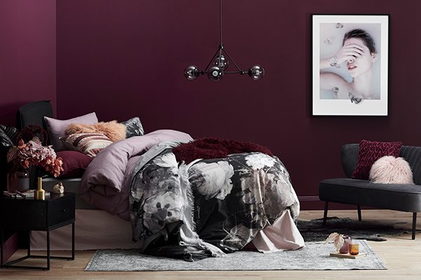
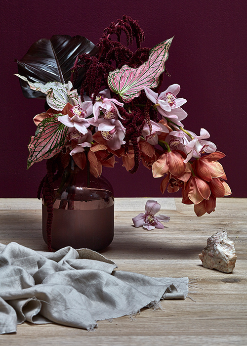
Berry embraces all of the sumptuous tones between red and purple on the colour spectrum, from lush violets to deep burgundies. It is sophisticated, romantic and bold - offering an intensity that both grounds and enhances interior schemes.
Being transseasonal, berry can be adapted to both brighter and moodier settings. Freshen up your summer look by injecting vibrant and saturated berry tones to add depth (but not heaviness) to your home. Berry can also imbue a sense of warmth and richness to your space, making it feel luxurious and comfortable in the cooler months.
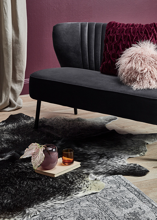
Because of the huge range of berry shades, it works beautifully in many textures. Create balance by layering textural and casual elements like linen cushions, velvet ottomans and woollen rugs within the same room to seamlessly combine contrasting materials in complimentary berry tones.
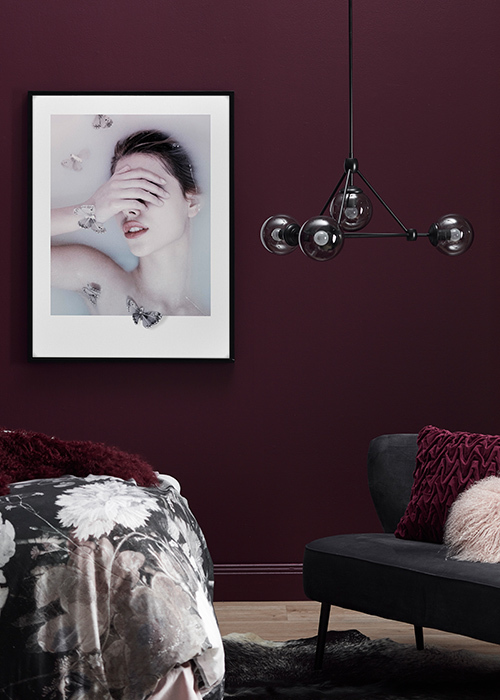
Berry has been readily endorsed in the interiors world through soft furnishings in beautiful velvets and linens, but it is also seen in statement occasional chairs for those wanting to really commit to the shade.
Berry can be seen in velvet ottomans, sofas and chairs, some of my favourites are our new Cherie armchair or Studio sofa in dusty rose. Velvet is a trend only just reaching its peak, and berry is a colour being applied to this material with vigour – even those cautious of trends are embracing this combination. Cushions, like this linen cushion in a dusty berry colour, are another less intrusive way to approach the colour in your home. Persian style rugs are always in vogue but this season the style is given new life through faded and saturated berry tones - try this Distressed magenta rug or this Vintage style Persian rug.
Vibrant artwork with interesting colour groupings featuring berry will also make their mark, like this vivid Geo print, or this Ascent print. While berry certainly has enough depth of character to endure the tide of trends, it's always better to introduce interchangeable elements to your home if you are unsure.
Berry is very flexible but it does work particularly well in a monochromatic scheme, whereby shades on the berry spectrum are layered within the same room. Think deep burgundies combined with velvety grape and rich plum accents, supported by softer mauve and blush for balance. The key with this striking scheme is to introduce neutrals to create moment for pause and break up the repetition.
Cool greys and deep navies also make a great match, amplifying berry's alluring and moody disposition and providing balance. To enhance this combination, introduce complementary jewel tones through emerald and amber hues. If you want to really push the boundaries and invigorate your scheme, try introducing tropical shades of mustard and burnt orange.
Why we love it
Berry embraces all of the sumptuous tones between red and purple on the colour spectrum, from lush violets to deep burgundies. It is sophisticated, romantic and bold - offering an intensity that both grounds and enhances interior schemes.
Being transseasonal, berry can be adapted to both brighter and moodier settings. Freshen up your summer look by injecting vibrant and saturated berry tones to add depth (but not heaviness) to your home. Berry can also imbue a sense of warmth and richness to your space, making it feel luxurious and comfortable in the cooler months.
Because of the huge range of berry shades, it works beautifully in many textures. Create balance by layering textural and casual elements like linen cushions, velvet ottomans and woollen rugs within the same room to seamlessly combine contrasting materials in complimentary berry tones.
How to use it
Berry has been readily endorsed in the interiors world through soft furnishings in beautiful velvets and linens, but it is also seen in statement occasional chairs for those wanting to really commit to the shade.
Berry can be seen in velvet ottomans, sofas and chairs, some of my favourites are our new Cherie armchair or Studio sofa in dusty rose. Velvet is a trend only just reaching its peak, and berry is a colour being applied to this material with vigour – even those cautious of trends are embracing this combination. Cushions, like this linen cushion in a dusty berry colour, are another less intrusive way to approach the colour in your home. Persian style rugs are always in vogue but this season the style is given new life through faded and saturated berry tones - try this Distressed magenta rug or this Vintage style Persian rug.
Vibrant artwork with interesting colour groupings featuring berry will also make their mark, like this vivid Geo print, or this Ascent print. While berry certainly has enough depth of character to endure the tide of trends, it's always better to introduce interchangeable elements to your home if you are unsure.
What to pair it with
Berry is very flexible but it does work particularly well in a monochromatic scheme, whereby shades on the berry spectrum are layered within the same room. Think deep burgundies combined with velvety grape and rich plum accents, supported by softer mauve and blush for balance. The key with this striking scheme is to introduce neutrals to create moment for pause and break up the repetition.
Cool greys and deep navies also make a great match, amplifying berry's alluring and moody disposition and providing balance. To enhance this combination, introduce complementary jewel tones through emerald and amber hues. If you want to really push the boundaries and invigorate your scheme, try introducing tropical shades of mustard and burnt orange.
Keen to try berry in your own space? Shop our latest range of berry-toned products on site now.
Explore More


Payment options
Head Office (No Showroom)
2/1-7 Unwins Bridge Rd, St Peters,
NSW 2044, Australia
Your customer reference #:
01-X-CSN