



Updated 6 January 2021
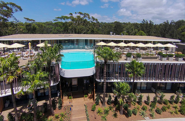
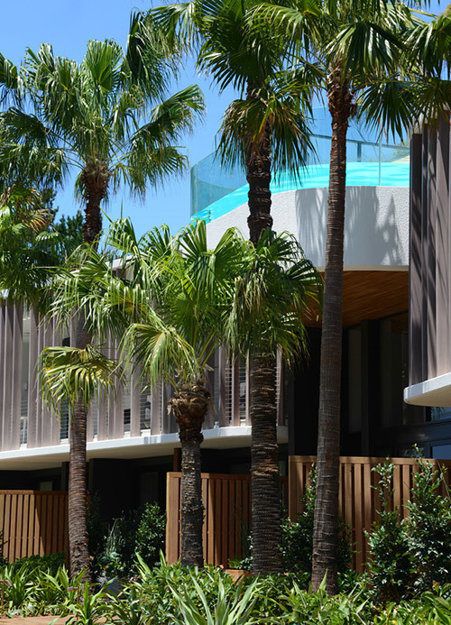
The NSW South Coast has a shining new jewel in Bannisters Pavilion, a companion to old favourite Bannisters. A few hundred metres away from the original, it adds 33 new rooms and 2 penthouse suites to the mix, along with a turquoise pool cantilevered above the entrance. We asked interior designer Romy Alwill about her concept for the hotel, and her favourite features. She collaborated on the project with designer Mia Ward, working with Molnar Freeman Architects and landscape designer William Dangar, pulling the whole thing off in only 7 months.
What was your starting point for the project, decoratively speaking?
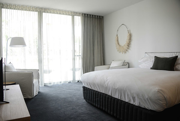
The concept for the general interior area of the hotel was that although it was in a coastal location, the interior had to respond to the eucalyptus forest that it backs onto. It was such a uniquely Australian symbol that it was hard to ignore. Then it was really about finding that nice balance between those elements that relate to the coast and those of the forest and rolling hills. That's the unique thing about the South Coast I think. That the countryside meets the sea so distinctly. So out of that response to the surroundings came a "modern coastal" palette with the clean modern lines referencing Scandanavian design as they so often subtly reference their forest context. Also the building was built from scratch - it didn't have old nuances. We had to respond to the clean modern architecture so a more modern approach seemed to fit. One thing I really didn't want was for it to be another "Hamptons" style hotel or interior. I think we've seen enough of that!
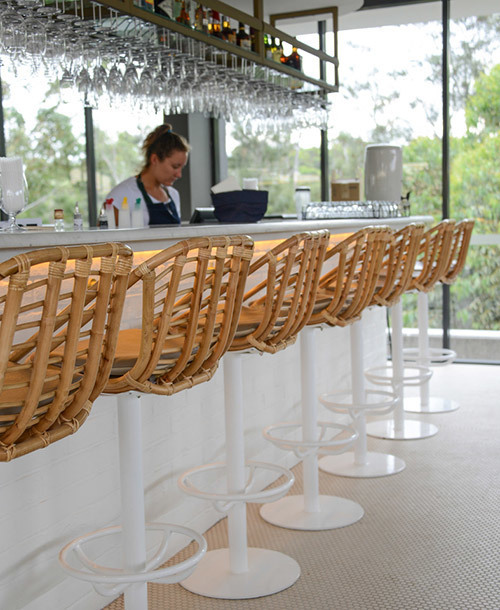
The Rooftop Bar and Restaurant had a separate concept. Due to its coastal views was to have a much more beachy feel. The underlying idea there was to make subtle reference to pool pavilions of the 1940's but with modern overlay.
How did you develop the colour palette?
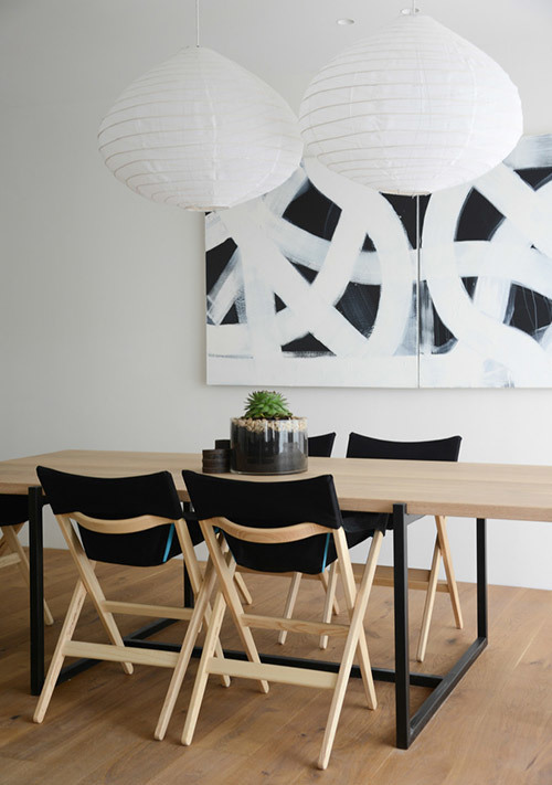
The richer moodier palette came from the forest. A dark charcoal/eucalyptus green carpet pared with lots of oak timber and earthy speckled terrazzo and concrete seemed to be the right references. The light that is filtered through the trees at the back of the hotel really impacts the light in the interior. Then the idea was to have lots of fresh colours to contrast that. White slip covered chairs to keep it fresh and relaxed, olive green rugs and a consistent reference through to black and white. Artwork that introduced subtle colours of the ocean and forest. Brass and oak to warm up the concrete and black and white. It's all about balance really. That balance between dark and light, hard and soft and cool and warm.
The Rooftop, in contrast, was to be fresh and bright and colourful, full of blues and greens and white, cane, yellow and brass to make it really uplifting but still relaxing. It's easy to be seduced by what is "popular" in bars and restaurants right now but we really wanted this to have it's own look and feel.
What do you think are the key considerations for 'holiday' decorating?
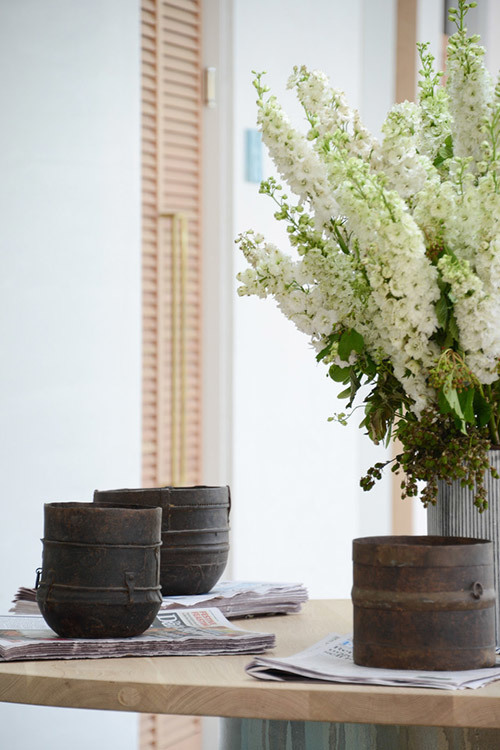
Keeping it simple. The idea of a holiday is to focus on you, isn't it? So to go to a space that doesn't compete with where you want to focus your energy seemed right. An interior that doesn't scream "look at me" but just lets you find your own place within it.
Tell us about the art pieces you sourced - what was the common thread you were looking for?
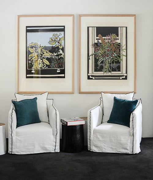
As with all hotels, we did have a strict budget to work to! So with art being the area that can really blow out (especially with such large wall spaces to fill) it wasn't easy to find the right mix of pieces to go in all the rooms, hallways and lobby spaces. Although each of those spaces needed something different, colour and mood were the common threads. Those blues through to greens and artwork that reference the natural environment seemed appropriate.
For the rooms we sourced photography and abstract prints from Johnny McCormack and Cressida Beale. The art in the hallways were found in the warehouse sale of Signature Prints. They are the screens that they used to print with over the years. They were downsizing and selling off their screens and I just love how old screens look with the layers of old paint and bit's of old tape. They are graphically interesting but tell a story too. So I carefully went through their thousands of screens to select the right subject matter and right tones. We also utilised ArtBank which is a great resource for this sort of situation and also a great supporter or Australian artists. Then there is the beautiful free abstract style of Cressida Beale in the lobby. We commissoned her to do pieces especially for us.
Do you have a favourite feature?
I think my favourite space is the lobby. The architect did create a beautiful space with the double height ceiling and mezzanine overlooking the reception so it was our job to respond with an equally beautiful palette. Concrete, oak, white textured porcelain, leather, linen, brass. The shapes and forms of the furniture and joinery are soft and feminine and personal in an otherwise grand space. But the result is a really calm interior that feels comfortable to be in.
Find out more at www.bannisters.com.au or follow Bannisters on Instagram @bannistershotels
Beach meets bush at Bannisters Pavilion
The NSW South Coast has a shining new jewel in Bannisters Pavilion, a companion to old favourite Bannisters. A few hundred metres away from the original, it adds 33 new rooms and 2 penthouse suites to the mix, along with a turquoise pool cantilevered above the entrance. We asked interior designer Romy Alwill about her concept for the hotel, and her favourite features. She collaborated on the project with designer Mia Ward, working with Molnar Freeman Architects and landscape designer William Dangar, pulling the whole thing off in only 7 months.
What was your starting point for the project, decoratively speaking?
The concept for the general interior area of the hotel was that although it was in a coastal location, the interior had to respond to the eucalyptus forest that it backs onto. It was such a uniquely Australian symbol that it was hard to ignore. Then it was really about finding that nice balance between those elements that relate to the coast and those of the forest and rolling hills. That's the unique thing about the South Coast I think. That the countryside meets the sea so distinctly. So out of that response to the surroundings came a "modern coastal" palette with the clean modern lines referencing Scandanavian design as they so often subtly reference their forest context. Also the building was built from scratch - it didn't have old nuances. We had to respond to the clean modern architecture so a more modern approach seemed to fit. One thing I really didn't want was for it to be another "Hamptons" style hotel or interior. I think we've seen enough of that!
The Rooftop Bar and Restaurant had a separate concept. Due to its coastal views was to have a much more beachy feel. The underlying idea there was to make subtle reference to pool pavilions of the 1940's but with modern overlay.
How did you develop the colour palette?
The richer moodier palette came from the forest. A dark charcoal/eucalyptus green carpet pared with lots of oak timber and earthy speckled terrazzo and concrete seemed to be the right references. The light that is filtered through the trees at the back of the hotel really impacts the light in the interior. Then the idea was to have lots of fresh colours to contrast that. White slip covered chairs to keep it fresh and relaxed, olive green rugs and a consistent reference through to black and white. Artwork that introduced subtle colours of the ocean and forest. Brass and oak to warm up the concrete and black and white. It's all about balance really. That balance between dark and light, hard and soft and cool and warm.
The Rooftop, in contrast, was to be fresh and bright and colourful, full of blues and greens and white, cane, yellow and brass to make it really uplifting but still relaxing. It's easy to be seduced by what is "popular" in bars and restaurants right now but we really wanted this to have it's own look and feel.
What do you think are the key considerations for 'holiday' decorating?
Keeping it simple. The idea of a holiday is to focus on you, isn't it? So to go to a space that doesn't compete with where you want to focus your energy seemed right. An interior that doesn't scream "look at me" but just lets you find your own place within it.
Tell us about the art pieces you sourced - what was the common thread you were looking for?
As with all hotels, we did have a strict budget to work to! So with art being the area that can really blow out (especially with such large wall spaces to fill) it wasn't easy to find the right mix of pieces to go in all the rooms, hallways and lobby spaces. Although each of those spaces needed something different, colour and mood were the common threads. Those blues through to greens and artwork that reference the natural environment seemed appropriate.
For the rooms we sourced photography and abstract prints from Johnny McCormack and Cressida Beale. The art in the hallways were found in the warehouse sale of Signature Prints. They are the screens that they used to print with over the years. They were downsizing and selling off their screens and I just love how old screens look with the layers of old paint and bit's of old tape. They are graphically interesting but tell a story too. So I carefully went through their thousands of screens to select the right subject matter and right tones. We also utilised ArtBank which is a great resource for this sort of situation and also a great supporter or Australian artists. Then there is the beautiful free abstract style of Cressida Beale in the lobby. We commissoned her to do pieces especially for us.
Do you have a favourite feature?
I think my favourite space is the lobby. The architect did create a beautiful space with the double height ceiling and mezzanine overlooking the reception so it was our job to respond with an equally beautiful palette. Concrete, oak, white textured porcelain, leather, linen, brass. The shapes and forms of the furniture and joinery are soft and feminine and personal in an otherwise grand space. But the result is a really calm interior that feels comfortable to be in.
Find out more at www.bannisters.com.au or follow Bannisters on Instagram @bannistershotels
Explore More








Head Office (No Showroom)
2/1-7 Unwins Bridge Rd, St Peters,
NSW 2044, Australia
Your customer reference #:
01-X-CSN