


Blog

Updated 8 February 2021
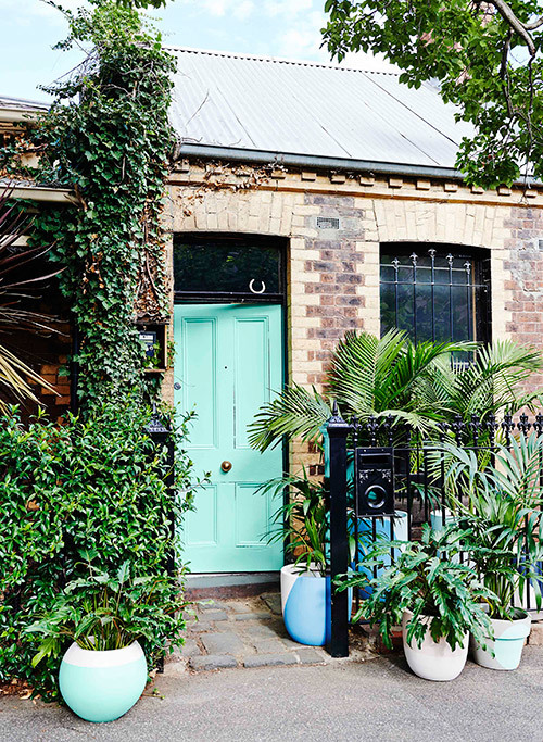
If you're in any doubt that interiors follows fashion, here's real life proof: a Melbourne interior created by Dulux colour expert and interior designer Bree Leech and stylist & writer Heather Nette King in collaboration with Australian fashion duo Ginger & Smart. We asked Bree Leech about working with a bold colour palette inspired by the prints in Ginger & Smart's A/W15 Arcadia collection.
For more colour inspiration, follow Bree on Instagram @breeleech. Both Bree and Heather are involved in the #DuluxColourRevolution paint giveaway - check out @duluxaus to find out more.
Designer Bree Leech's tips on decorating with bold colour
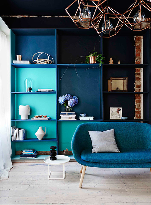 Image - Lisa Cohen
If you're in any doubt that interiors follows fashion, here's real life proof: a Melbourne interior created by Dulux colour expert and interior designer Bree Leech and stylist & writer Heather Nette King in collaboration with Australian fashion duo Ginger & Smart. We asked Bree Leech about working with a bold colour palette inspired by the prints in Ginger & Smart's A/W15 Arcadia collection.
 A tiny Melbourne cottage was transformed with colour. Image - Lisa Cohen.
Tell us about the creative process behind bringing Ginger & Smart's Arcadia collection to life in an interiors context?
I created concepts based on 3 prints from their Arcadia collection then we worked very closely with Alexander & Genevieve to refine them. Once we were all happy, Heather Nette King and I curated all the interior décor, working very carefully to ensure it reflected Ginger & Smart's brand and collaborating with the designers to ensure each piece was a reflection of what the Ginger & Smart woman may have in their own home.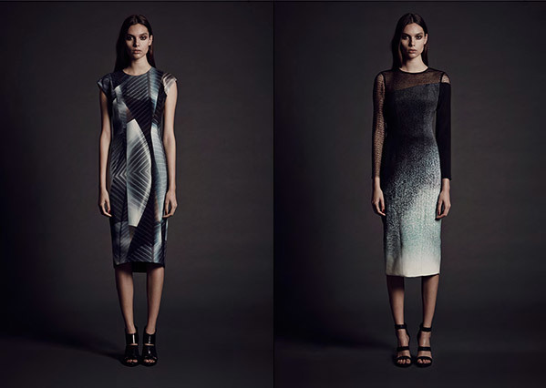 Two looks from Ginger & Smart's Arcadia Collection
How did you interpret the Arcadia collection – what was the 'mood' you were looking to achieve in the home?
The Ginger & Smart Arcadia collection was diverse, feminine and pretty but also had a sense of underlying strength – Alexander & Genevieve had communicated that the collection represented a balance of opposing elements that resulted in harmony – this was what I really wanted to have translate in the interiors and I think that's what you see in the end result.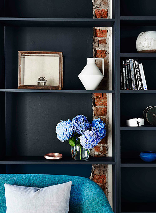 Image - Lisa Cohen
The built in shelving in the living space, featuring the deep blue/black of Dulux Metalise is so striking. Decoratively, what are the considerations for using dark colour in a room?
It is a brave move to use darker colours, but every time I've done so or encouraged someone else to, the result is amazing. Dark colours such as Metalise can make rooms feel more spacious, ugly ceilings disappear or just add much needed drama to a space. In this case the ceiling was not the best feature of the room but once it was painted many of its faults were hidden and it provided the perfect backdrop to show case Ben-Tovim Design's beautiful copper chandelier.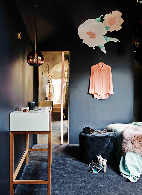 Image - Lisa Cohen
You also used teal and turquoise in the living room. Can you share any advice or 'rules' for finding a balance between different colours in a room?
Similar undertones are the key to using different colours in a room but still creating a harmonious space – to keep it simple, use colours from the same family. In this case blues and blue greens work together effortlessly. The other important factor is the proportions – work out what you want to highlight in the space and focus on using colour to achieve that. If you are struggling to pull together a palette, you can be inspired by fashion in the way we have. Look at your favourite print – what are the colours used and what are the proportions? Try reflecting this in your space through paint and décor. If it already works in the print it will work in a room as well.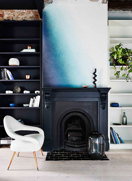 Image - Lisa Cohen
The ombre effect on one wall and above the mantelpiece is like a work of art in itself. How was this applied?
This is a professionally applied affect created with the use of a spray gun and layers of different colours, carefully balanced. For the super keen DIYer, you could try to achieve this by using 1 colour in different strengths from dark to light but I do recommend if you want to recreate this look to speak to a Dulux accredited painter to discuss what can be achieved.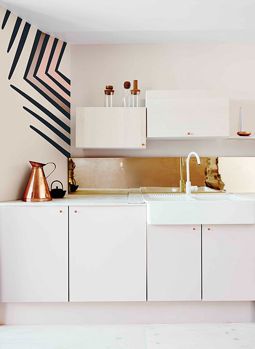 Image - Lisa Cohen
Metallic accents are featured in both the darker and lighter spaces. What do you think they add to each?
Metallic accents always add an element of luxury – in this case it also reflected the signature colour of the Ginger & Smart brand. The accents add something special to lift the space to the next level. I think they work especially well against coloured backgrounds – like copper & rose gold against pink or dark blue – it's a gorgeous effect.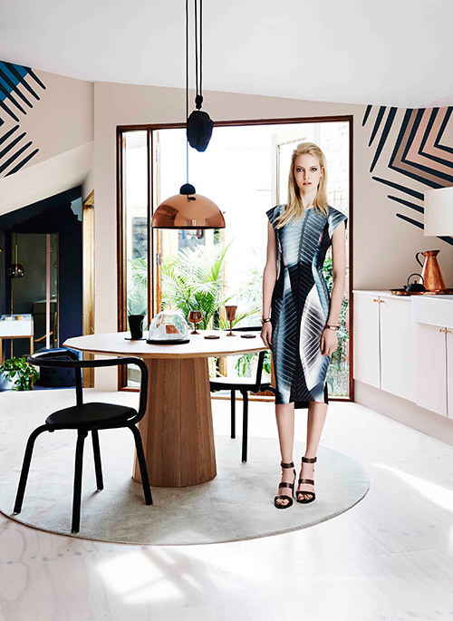 Image - Lisa Cohen
Which is your favourite room in this home, and why?
Too hard – I love them all for different reasons – the cocoon-like space of the bedroom with the feminine touches of florals, the surprising pink hues in the light-filled kitchen and the luxury created with colour in the living space. It is the perfect home in that each room suits a different mood, and you can imagine yourself moving through the spaces as the day progresses.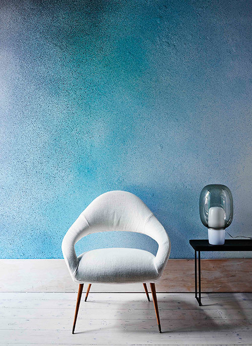 Image - Lisa Cohen
When in doubt, we all revert to white or neutrals. What's the least scary way to start experimenting with colour at home?
I think at first with accessories – introduce some colour that you think you might love – most people will find it builds from there. Try painting furniture items that need a new life – I think this becomes addictive, once you see the transformative effect a coat of paint has you'll be looking around for the next thing to paint and it wont be long before you build the confidence to paint a door, a wall and then a whole room. If you really want to use colour but just cant quite pull it together I highly recommend engaging a professional designer – most people are surprised by how affordable a Dulux Colour Consultant can be and they can provide the confidence you lack to provide the end result you are after.For more colour inspiration, follow Bree on Instagram @breeleech. Both Bree and Heather are involved in the #DuluxColourRevolution paint giveaway - check out @duluxaus to find out more.
Explore More


Payment options
Head Office (No Showroom)
2/1-7 Unwins Bridge Rd, St Peters,
NSW 2044, Australia
Your customer reference #:
01-X-CSN